Arizona Science Center Website Redesign

Improving navigation, exhibit discovery, and ticket booking through usability testing with 9 participants.

A research-led website redesign for Arizona Science Center. The project used moderated usability testing, heuristic evaluation, and content restructuring to improve exhibit discovery, FAQ access, mobile navigation, and ticket purchasing.

Overview

Role and context

This redesign study evaluated the Arizona Science Center website through moderated usability testing, accessibility review, and interface analysis. The work focused on visit planning tasks: finding exhibits, locating FAQs, using mobile navigation, and buying tickets.

Problem statement

Visitors had trouble finding key planning information, comparing exhibits, understanding ticket options, and completing checkout. Testing showed low task success, unclear FAQ/refund paths, mobile menu issues, and unreliable search results.
Audience

Families, students, tourists, and returning visitors planning visits, exploring exhibitions, and purchasing tickets online.

Core lens

Usability, information clarity, intuitive navigation, accessibility, and reducing cognitive load during high-friction tasks.

Format

Focused redesign of high-friction website pages identified through usability testing, heuristic evaluation, and IA review.

Strength shown

Usability testing, research synthesis, information architecture, interaction design, and evidence-led redesign decisions.

Observations

Quantitative Research With 9 Participants

I conducted moderated usability testing with 9 participants across navigation, ticket purchasing, information discovery, FAQ access, search, and mobile usability. The study measured task success rates, repeated usability issues, and user behavior across core visit-planning journeys.

62%

61.6% overall task success rate across common visitor tasks.

67%

66.7% of participants had difficulty with ticket purchasing, including cart actions and ticket type comprehension.

100%

100% of participants reported irrelevant search results while looking for exhibits, FAQs, and support content.

100%

100% of participants struggled to locate FAQs and refund information, making support content a critical information architecture issue.

78%

77.8% of participants encountered mobile menu issues related to responsiveness and discoverability.

Process

From usability findings to clearer visit planning.

The redesign translated observed task failures into changes across navigation, content hierarchy, exhibit browsing, ticket selection, and system feedback.

Identified high-friction user tasks

Focused on the tasks where participants struggled most: ticket selection, FAQ discovery, exhibit comparison, event timing, search, and mobile navigation.

Outcome: Prioritized the pages and flows tied to low task success and repeated hesitation.

Restructured navigation and information hierarchy

Used card sorting and observed mental models to reorganize navigation labels, homepage sections, and exhibition categories.

Outcome: Moved key visit-planning content into easier-to-find navigation and page sections.

Simplified the ticket purchasing flow

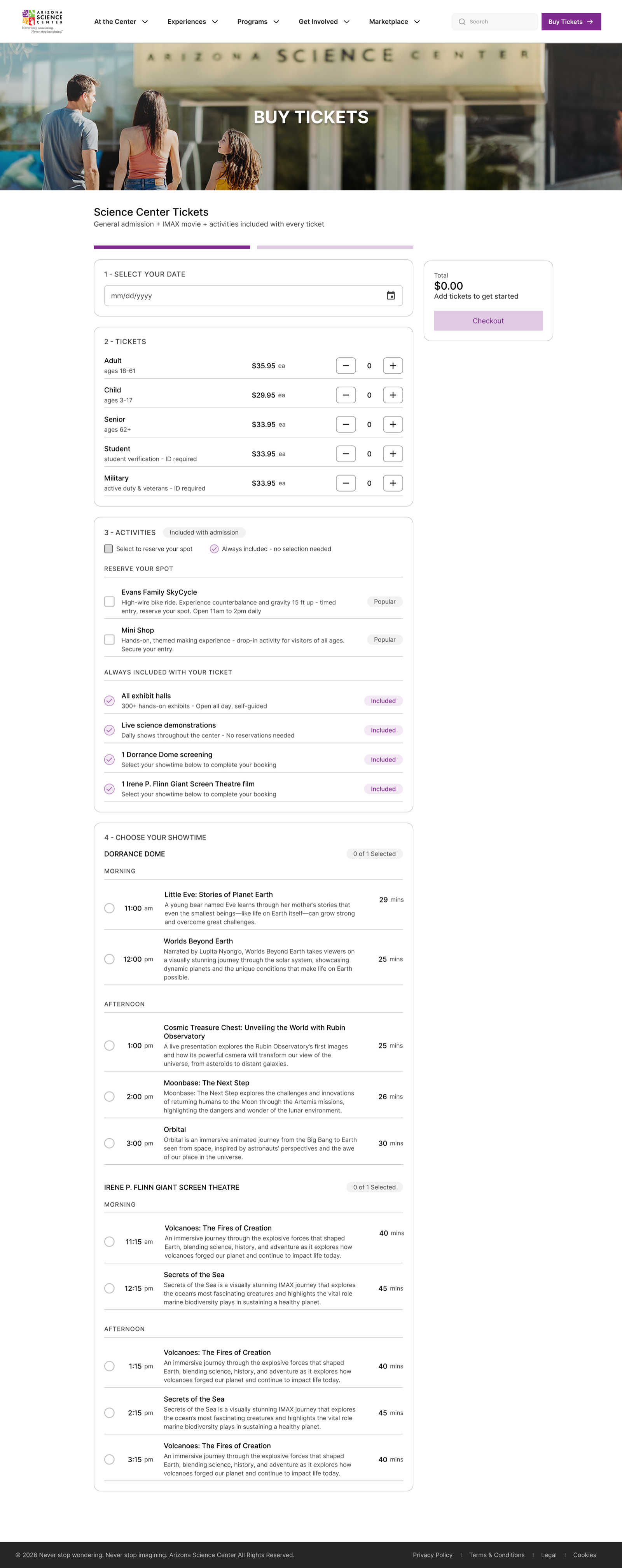
Redesigned ticket selection as a guided flow with clearer ticket types, visible inclusions, fewer unclear actions, and supportive microcopy.

Outcome: Reduced uncertainty during ticket comparison, cart review, and checkout.

Created consistent exhibition browsing experiences

Standardized exhibition pages so visitors could scan descriptions, timing, interaction type, and educational content in a predictable order.

Outcome: Made exhibits easier to compare across list and detail pages.

Improved clarity through system feedback and guidance

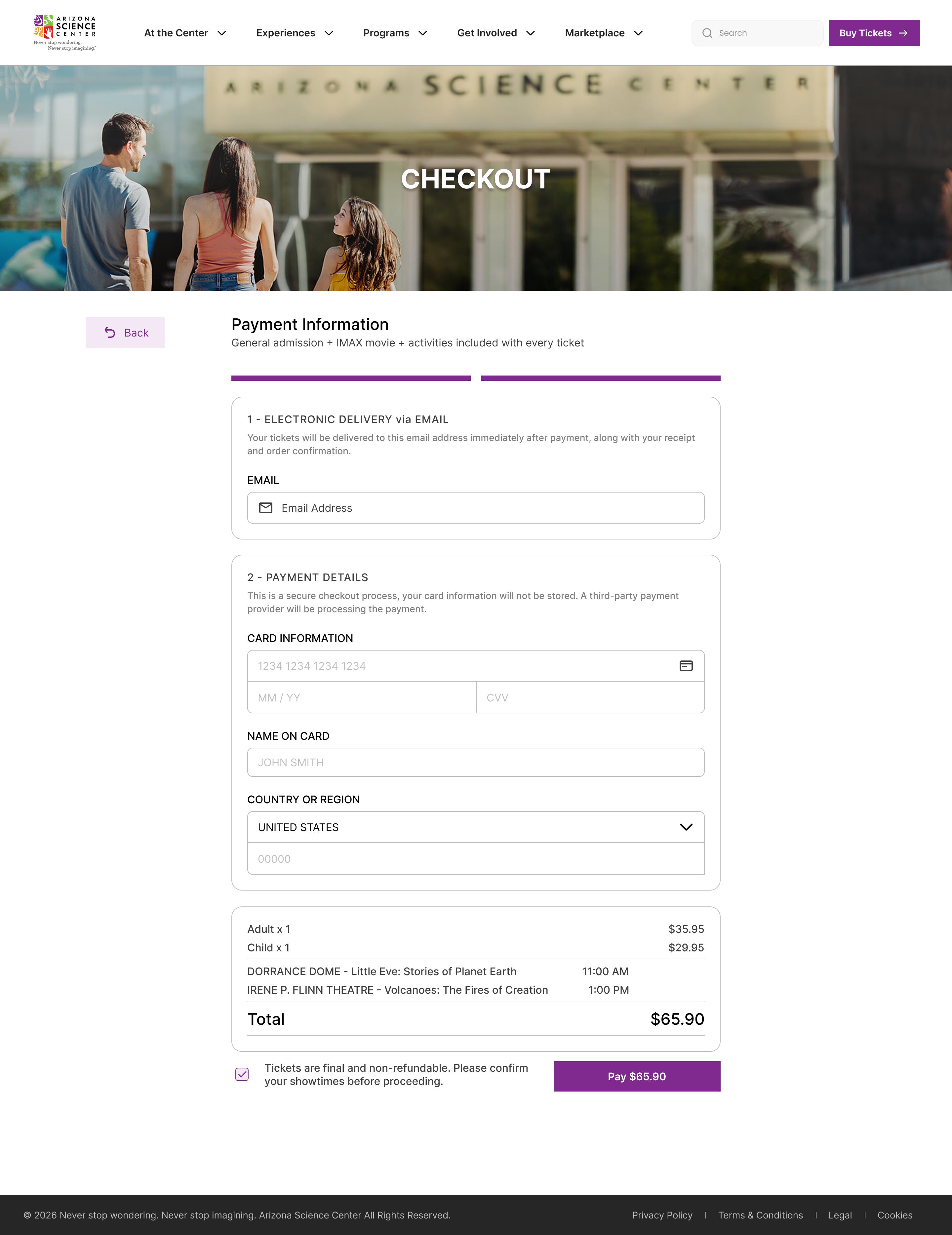
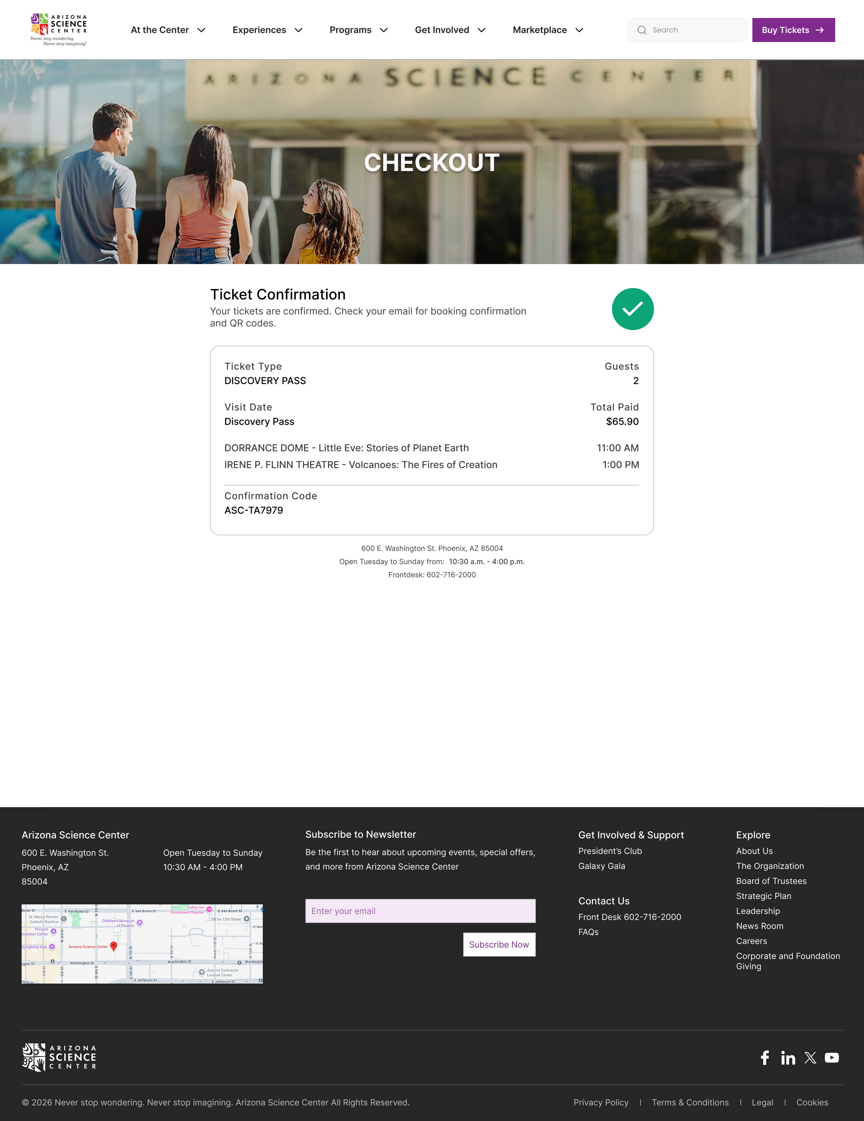
Added confirmation screens, payment guidance, refund context, and checkout messaging at decision points.

Outcome: Made key actions feel more predictable during ticket purchase.

Key decisions

Design Decisions Backed by Testing

The strongest redesign moves came directly from the 9-participant usability study: support content needed clearer paths, ticketing needed guidance, and exhibit pages needed a predictable structure.

Reduced confusion through clearer navigation

Navigation labels and homepage categories were reorganized around visitor planning tasks.

Impact: Exhibits, events, films, tickets, FAQs, and support content became easier to locate from primary page areas.

Prioritized important information earlier in the experience

Exhibit details, timings, ticket inclusions, FAQs, and refund information were surfaced earlier in the page hierarchy.

Impact: Reduced scanning effort for common visit-planning decisions.

Simplified the ticket purchasing process

The ticket flow became a structured sequence with clearer ticket types, visible inclusions, fewer ambiguous steps, and support copy.

Impact: Helped visitors understand what they were buying before payment.

Created consistent exhibition structures

Exhibition pages used a unified layout for descriptions, interaction type, educational content, and supporting resources.

Impact: Made exhibit comparison easier across the browsing flow.

Improved reassurance through system feedback

Confirmation messages, payment disclaimers, and contextual guidance were added throughout checkout.

Impact: Reduced hesitation at purchase and confirmation moments.

Before & after

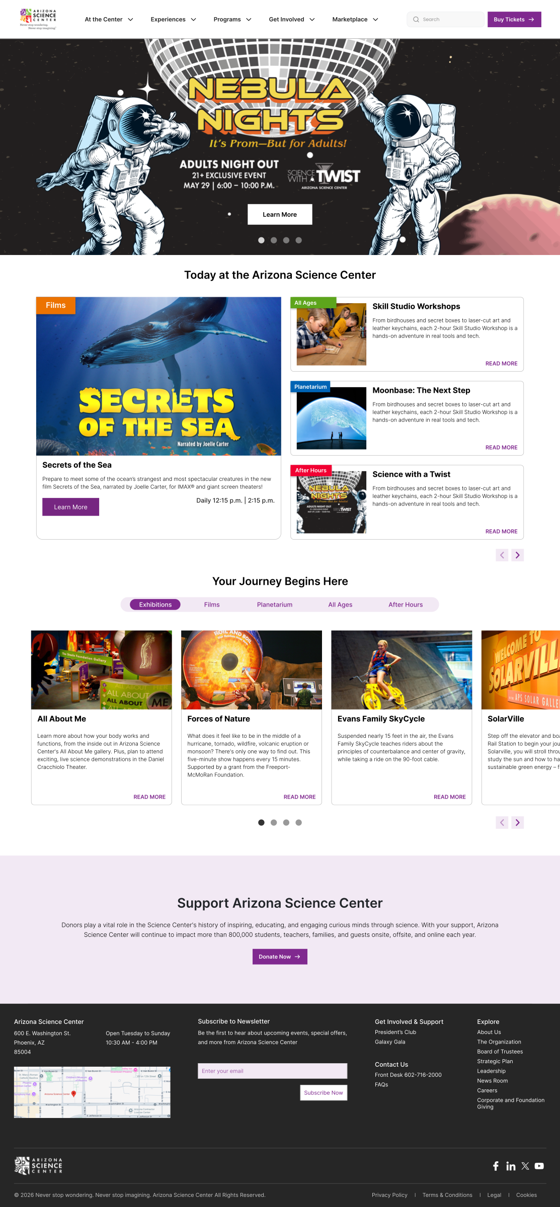
Homepage & navigation

What changed

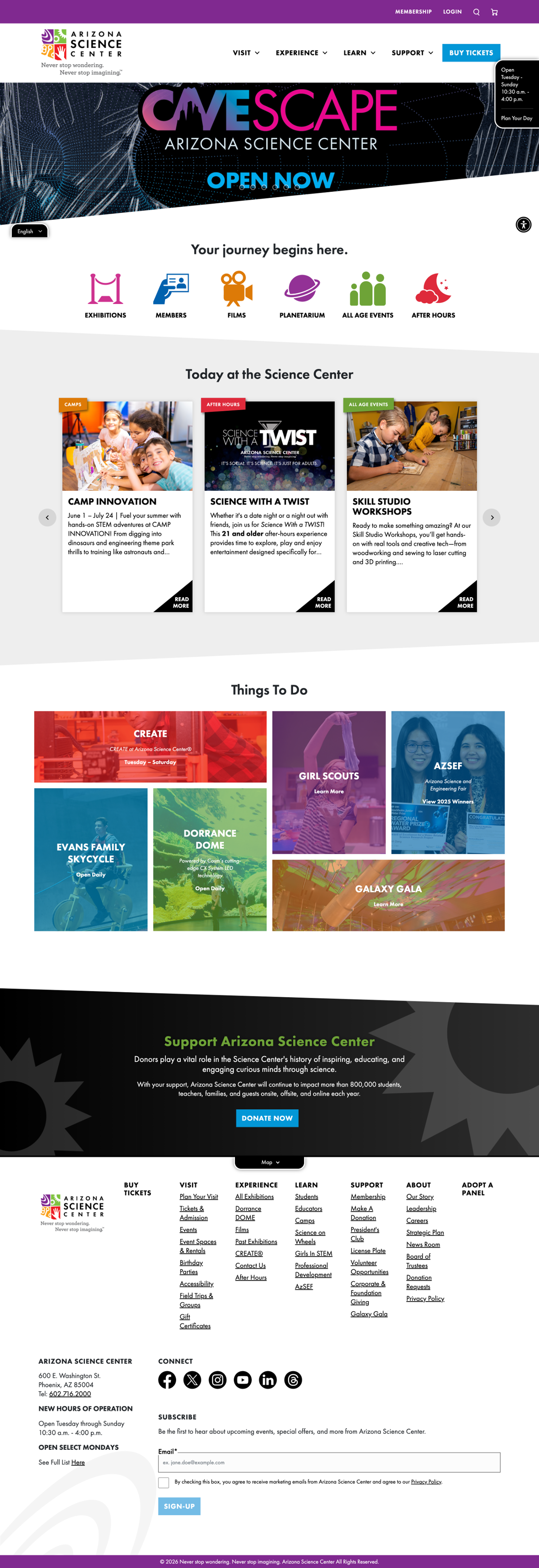
Reorganized navigation labels, homepage categories, and exhibition discovery paths based on card sorting and usability findings.

Why it changed

Participants struggled to find exhibits, events, tickets, FAQs, and refund information from primary navigation paths.

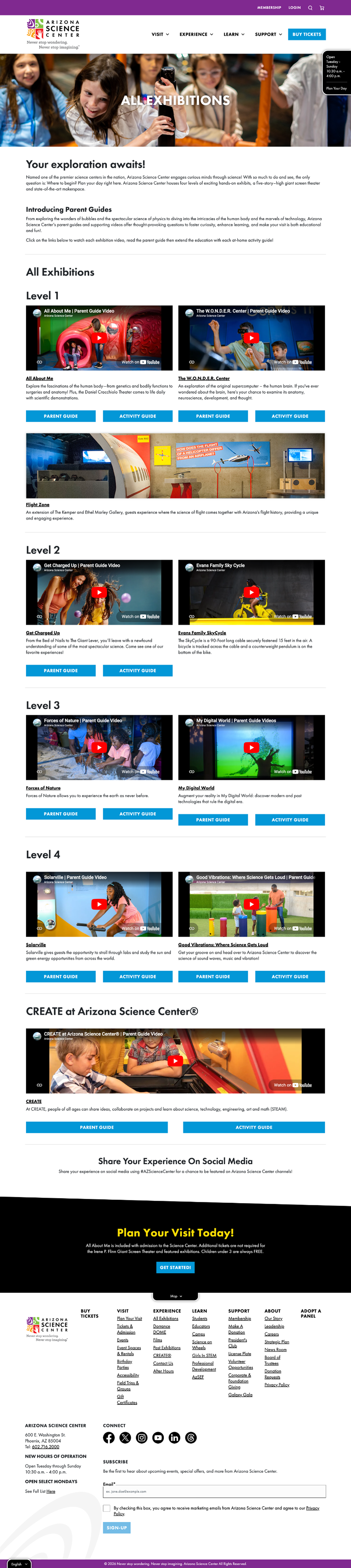
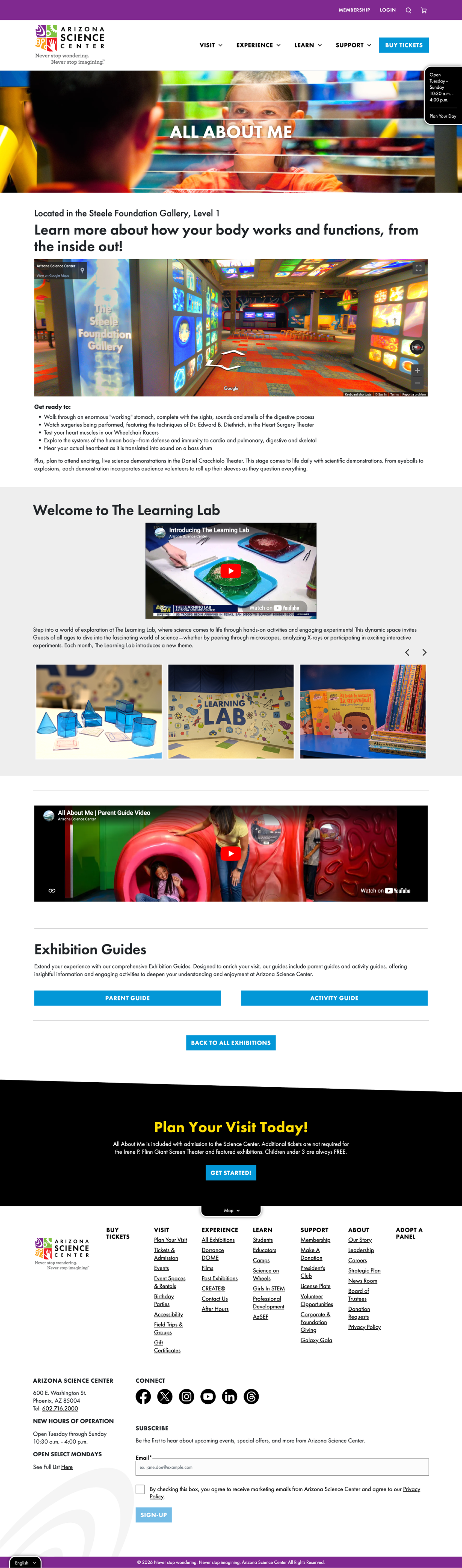
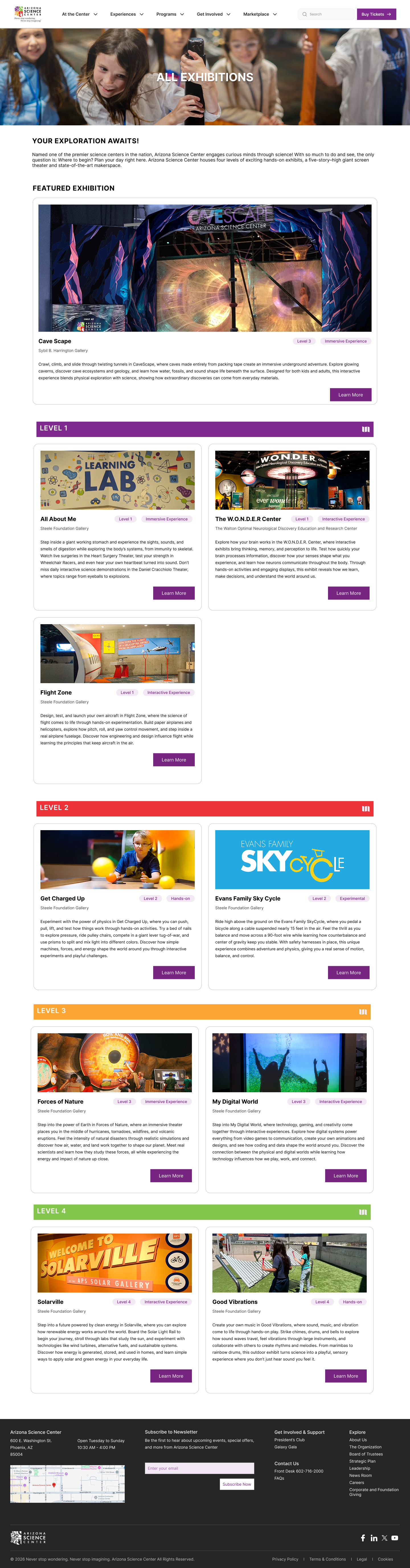
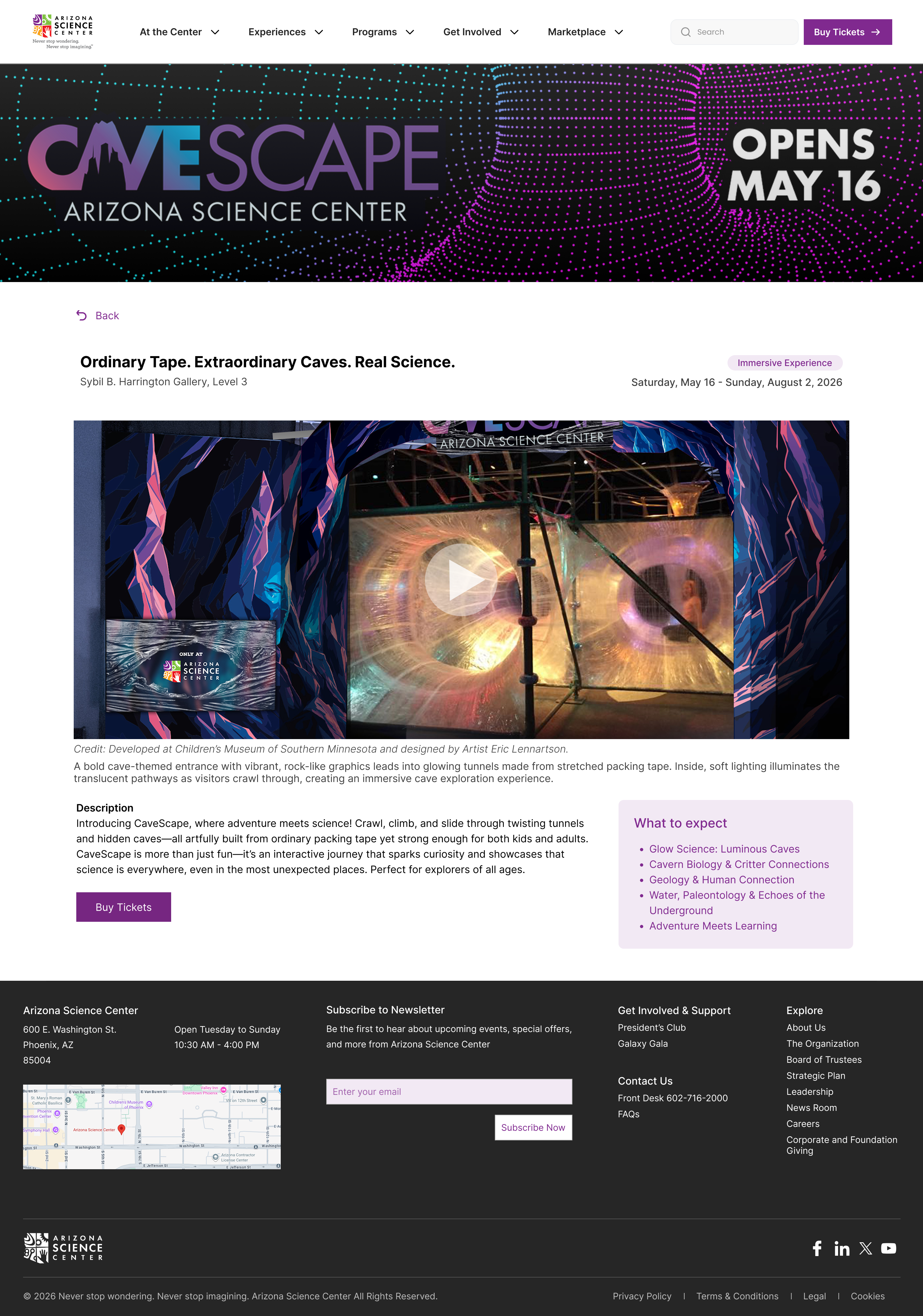
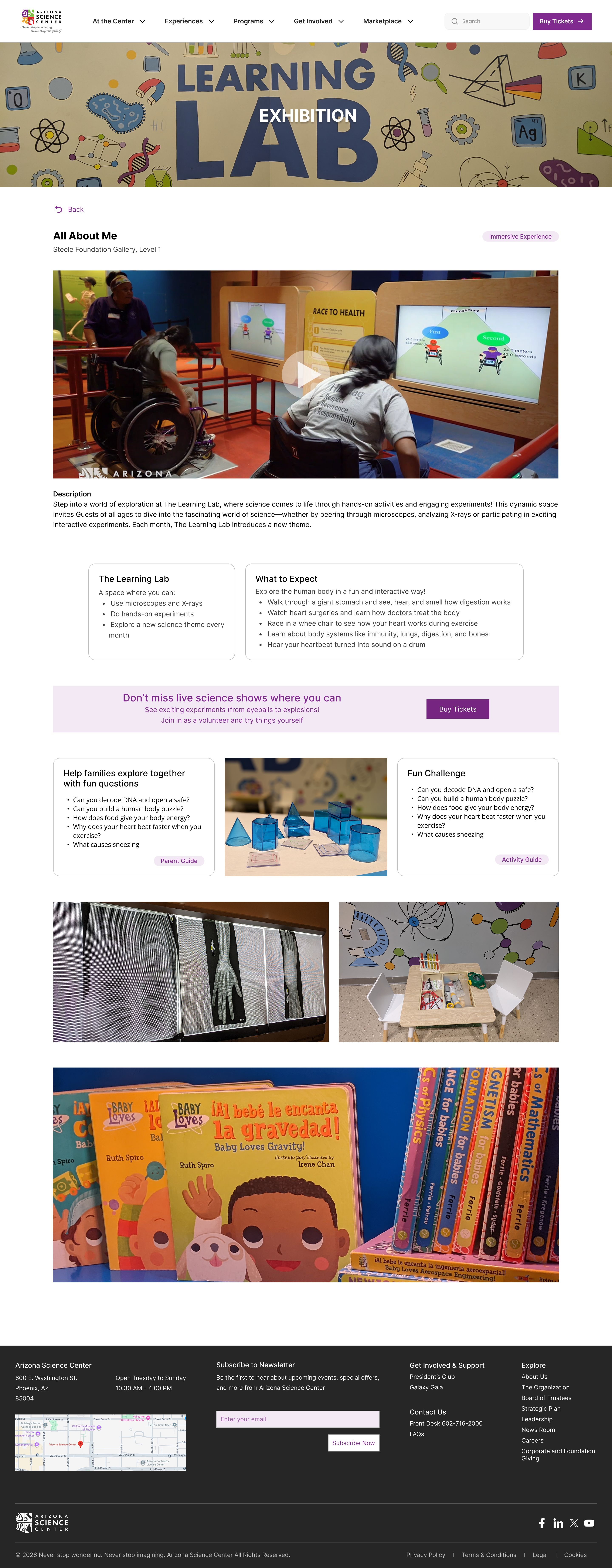
Exhibition browsing page

What changed

Standardized exhibition layouts with consistent placement of descriptions, timings, interaction types, and educational content.

Why it changed

Fragmented page structures increased scanning effort and made exhibit comparison harder.

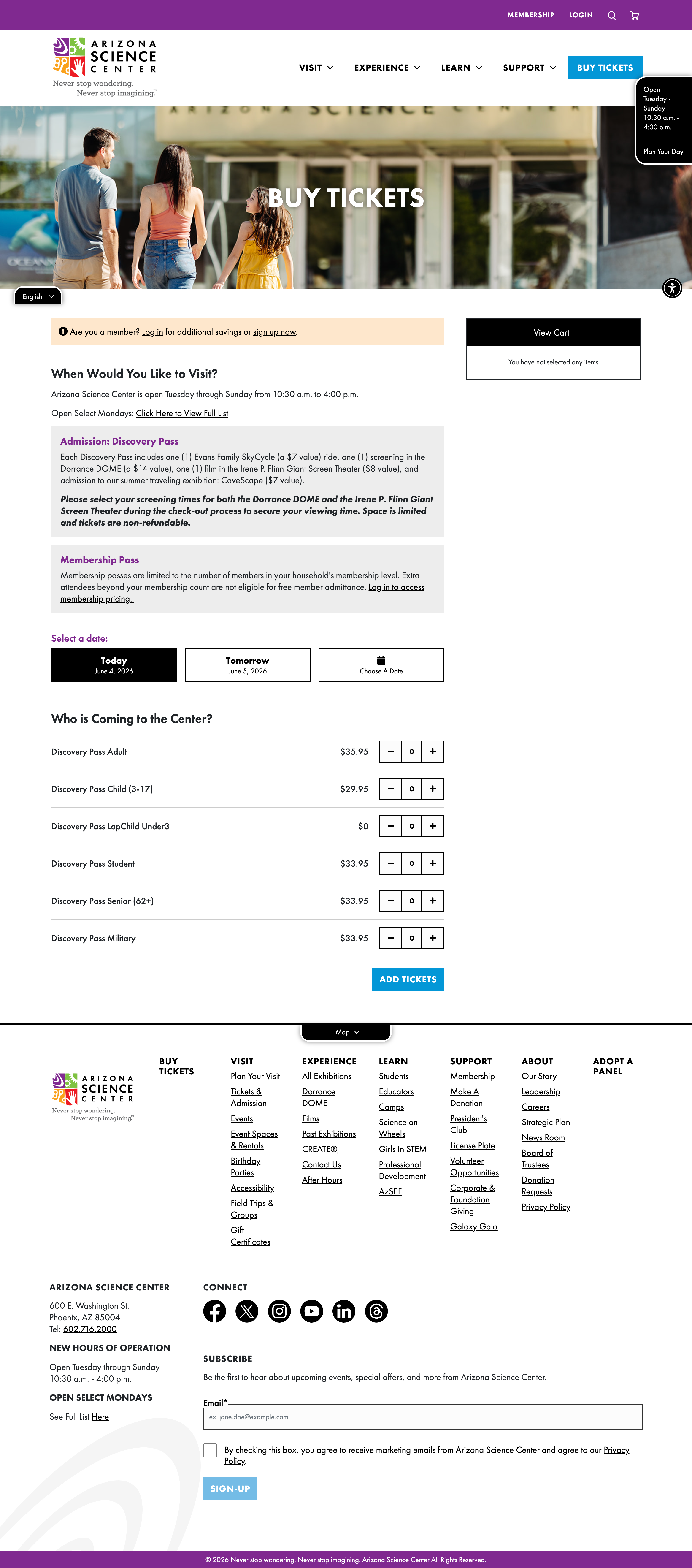
Ticket purchasing flow

What changed

Restructured checkout into a guided step-by-step flow with clearer ticket types, inclusions, and support copy.

Why it changed

Testing showed confusion around ticket options and checkout steps, especially during cart and payment tasks.

Outcome

What the Redesign Improved

The redesign addresses the major usability issues found in testing: navigation clarity, ticket purchasing, exhibit browsing, mobile discovery, search alternatives, and support content access.

Improved navigation and information discovery

Reorganized navigation and homepage sections created clearer paths to exhibits, events, tickets, FAQs, and refund content.

Reduced friction during ticket purchasing

The revised ticket flow clarified ticket types, inclusions, cart actions, and checkout steps.

Created a more consistent browsing experience

Exhibition pages followed a unified structure for scanning, comparing, and understanding exhibit options.

Improved trust through clearer system feedback

Confirmation states, disclaimers, and supportive microcopy made purchase steps easier to understand.

Reflection

What I Would Improve Next

Next, I would run a follow-up usability test on the redesign, compare task success against the original baseline, and complete a deeper WCAG review across mobile and desktop breakpoints.

I would also explore:

  • •Measuring task completion improvements after redesign
  • •Testing navigation discoverability across different user groups
  • •Refining mobile interactions for quicker access to visitor information
  • •Iterating further on accessibility, guidance, and system feedback patterns

Contact

Let's Connect

I would love to hear from you whether it is about design or new opportunities. Always excited to connect and share ideas.